
Everyone tended to start with a black, and three neutral greys. This would let you do monochrome shading, and saved you from making stupid colour decisions early on. From there you would typically buy a light and dark pair of pens in the same hue, giving you the ability to add shading in that one colour.


So every time you wanted a new colour, you had to buy two pens. Two seventeen dollar pens, which require individual thirty dollar ink refills. It's a bigger racket than the one for printer refills!

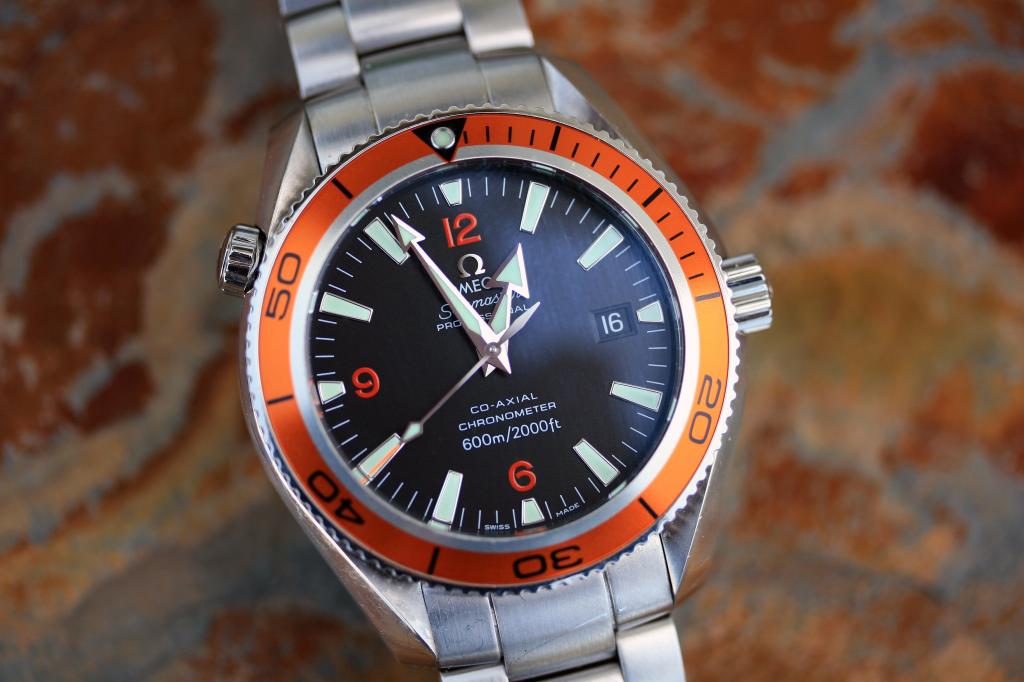
Inspired by designs like the outrageously orange Omega Planet Ocean, and various iconic Lamborghinis, i decided to build a palette of what i deemed "man colours".
Man colours was the best! All i had to do was pair a single bright, non-primary colour with greys or metal finishes i could handle with my original three pens. Bright orange, light steel blue, violet/cool lavender, and lime green all worked excellently. You could use a bright colour like purple, and still come across all "chest wig" manly thanks to the existence of the Lamborghini Diablo.

Now some fifteen years on, man colours are a serious, and widespread marketing tool. When a company wants to remove absolutely all ambiguity about the gender assignment of a product, this is always their move. Interestingly, but in hindsight not unexpectedly, that trend is no more obvious than in the shampoo aisle at a supermarket.


I especially like the one that modelled their bottle design on an axe handle. I imagine firemen and lumberjacks washing their hair, picking up the bottle, and thinking "Yes, yes. This feels right."
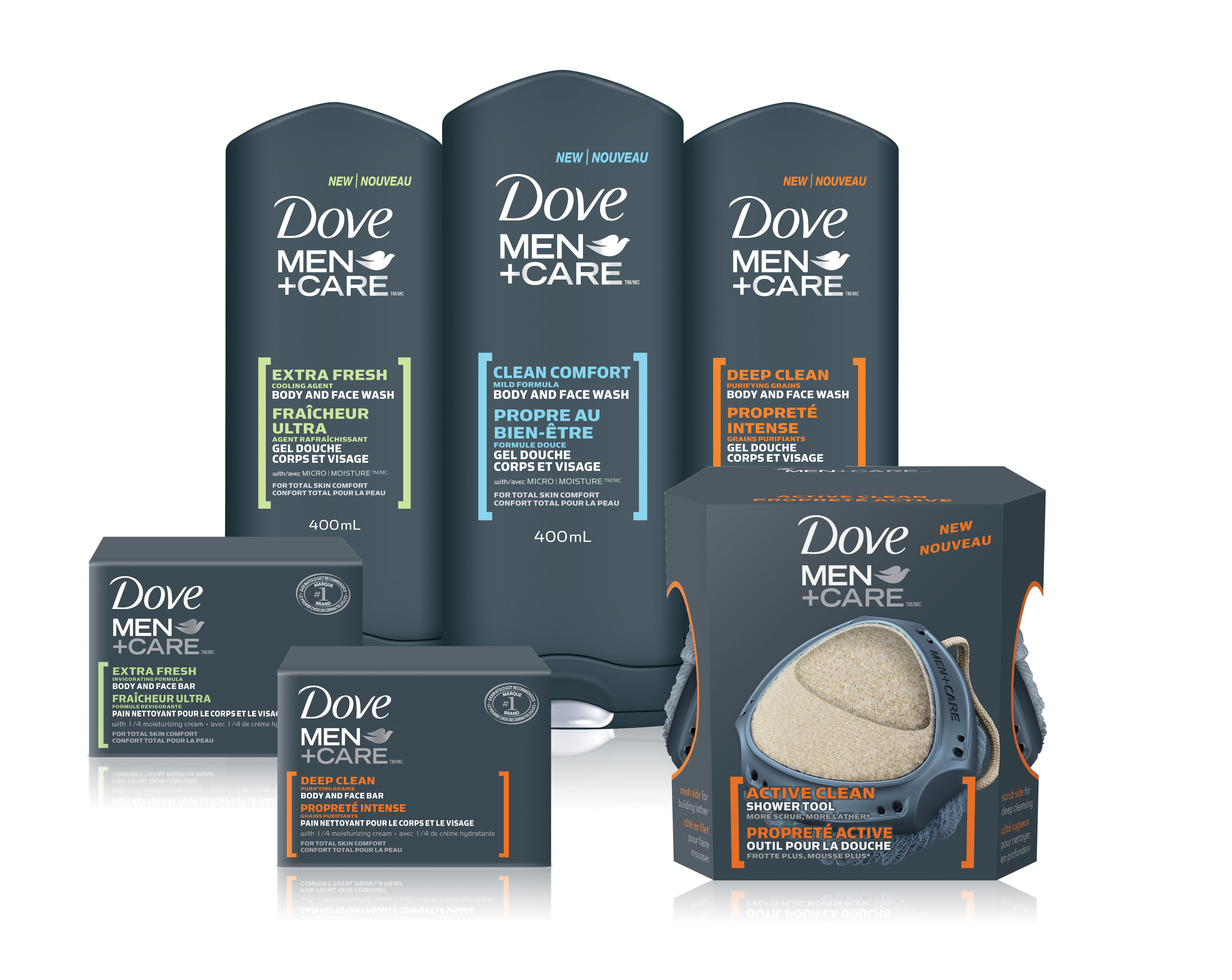
Damn, that thought was so manly i just grew a beard! Fortunately, there's something grey and orange and not at all for a woman for that:

I do love the mixture of bravado and stoicism evoked by the man colours palette. I should be repelled by its shameless ubiquity these days, but what's the alternative? Pastels?!
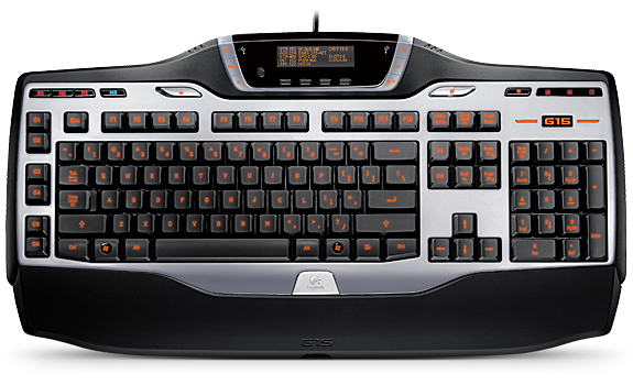
Disclosure: The keyboard i typed this post on is manly.
Damn, that thought was so manly i just grew a beard! Fortunately, there's something grey and orange and not at all for a woman for that:
I do love the mixture of bravado and stoicism evoked by the man colours palette. I should be repelled by its shameless ubiquity these days, but what's the alternative? Pastels?!
Disclosure: The keyboard i typed this post on is manly.
No comments:
Post a Comment